
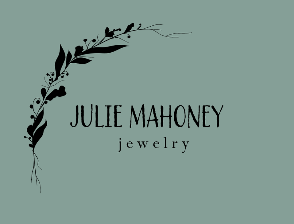
Julie Mahoney Jewelry
The first logo that was ever entrusted in me to be created was by my Painting and Drawing Professor from Western Illinois University. In the late stages of her career, she took up a metals class at the University and started her own jewelry business. Sales began to take off at an alerting rate, and Julie knew she needed some branding.
It took many months of collaborating, redrawing, redesigning, and endless amounts of typography samples. Julie was an artist as well, and while her focus was not in design, she still knew a good design when she saw it. Working with her gave me the opportunity to see the importance of communication with a client. To her, this was more than just some business, this was her baby. Seeing that self-identification to her business opened my mind to the possibilities of design and how much it means to the client.
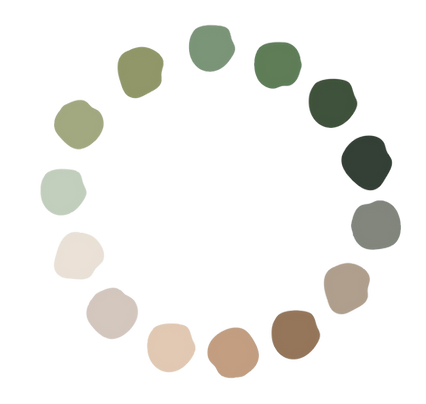
This is the color palette I chose for Julie's business. Yes, that is actual watercolor swatches that I mixed and painted! Julie's jewelry reflects the experiences that she has had in nature and she wanted the palette to represent that.

Macomb Arts Center
My first official logo that I ever made for a reputable organization was the Macomb Arts Center located in Macomb IL. The Arts Center decided to hold a rebranding contest and I decided to send in two submissions. About a month later, I was notified that one of my designs had been chosen as the winner. After a few revisions and discussion about the typography tying into the historical lettering on the building, the director and I collaborated on a final product that you see before you.
The final installation of the new logo was completed in April 2020. If you want to know more about this commission, you can follow the link below to an article I wrote about it on my blog.
.png)
Jameson's Journeys
One of my favorite logo experiences was creating a logo for Payton Jameson's Travel Blog titled "Jameson's Journeys". Payton has evolved and grown on her own path through her travels and wanted to share her experiences with the world. Together we brainstormed what travel meant to her and the symbols, colors, and iconography that she carried with her across foreign lands. Payton wanted nature, hands, and a compass-like feature included in the logo. Through my design process I was able to bring those elements together into one and mold them into the logo you see before you.
Payton wanted a more hand-drawn organic style for her logo design. She wanted it to capture her nomadic nature. This logo came from a charcoal sketch that I had drawn while brainstorming.
I uploaded that sketch directly into Adobe and created the raw, whimsical logo you see before you.
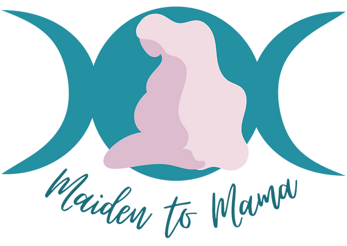
Maiden to Mama
Maiden to Mama has been one of my favorite projects to date. Carolyn Parrish, Dharma + Matrescence Coach had a vision for what her life's purpose truly was. In the midst of her pregnancy and still working a 9-5 job, Carolyn came to me with the vision of what she wanted her business to be. She received her Dharma Coaching Certification and was beginning to see clients, still with no branding or identity to her business. Together, we created a vision board full of manifestation and visualizations of what Maiden to Mama could be.
The logo you see before you is that result.
Maiden to Mama is meant to support expecting mothers and current mothers on the journey of motherhood. We all start out as a wild maiden and some choose the path of motherhood or happen upon it. Motherhood is a transformative experience and Carolyn wanted to guide others along the way. She wanted her brand to reflect royalty, softness, and luxury. She wanted it to embody a Goddess energy and a relationship with Mother Luna, the moon. Like the phases of the moon, so is motherhood and she challenged me to capture that.
Carolyn also hired me to create her website from the ground up, including fully customized graphics, templates, and designs relevant to her brand.


Authentically Spiritual
Anna Vahlenkamp is the founder of the Authentically Spiritual Workshop and connected with me for a logo design for her workshop.
The workshop is meant to align women with their higher self and help them to live a spiritual life in an authentic way.
Anna and I collaborated on a Virtual Vision Board for her business and together found the embodiment of the logo. She wanted naturally warm and welcoming colors. It was my personal decision to include a portrait graphic of her, because while the workshop focuses on the client, I wanted Anna to take ownership of her workshop and embody the spiritual boss babe that she is!


Genesis ABA
Brittany and Miranda are ABA Therapists n the Chicago area who had a dream to start their own therapy business. Both women come from a strong Christian Faith and want to incorporate biblical teachings into their therapy and counseling services.
When working with these lovely ladies, they explained ABA therapy to me and also expressed their belief that no individual is the same. They said each person is like a beautiful flower, growing and blossoming at the aligned individual time. I loved this thought. They wanted to name their business "Genesis ABA" in correlation with the Old Testament book Genesis; the beginning.
They wanted a more organic logo, hoping to stray away from a clinical, cold, modern logo. They wanted colors and fonts that signified hope, compassion, and fun.
For this logo I went back to my roots and actually painted the graphic you see before you. I found that while trying to create this purely from Adobe Illustrator, it wasn't portraying that organic, homegrown feeling that my clients desired. It was fun to get back into my paints again and deliver a logo that will help so many in the years to come.

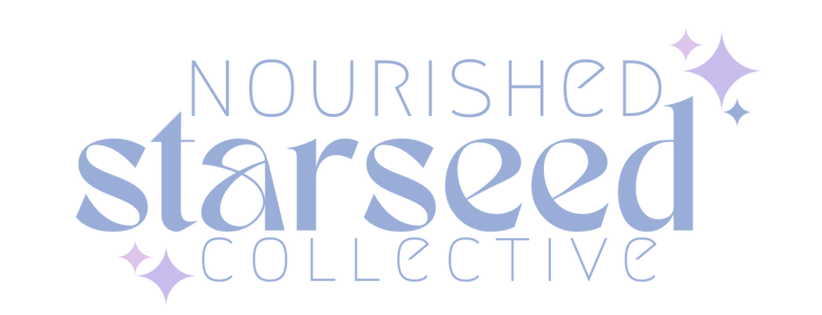
Nourished Starseed
Amanda came to me with the beginnings of a vision.
A vision of a community for people who have struggled with illness. Whether that was chronic inflammation, disease, or a specific diagnosis, she wanted to create a landing place for all.
Amanda struggled with her health for years before finally being diagnosed with Lyme Disease. It overtook her life and she had to completely rebuild herself and her relationship to her body. She has clawed her way back to health, but her journey is a never ending fight. Through her journey she has met so many amazing people with similarities. Together these people have formed a collective. Amanda is the owner of Amanda Nova Wellness and Olive + Grace Apothecary.
The client's goal was to have the logo reflect the embodiment of where we begin, where we come from. At the end of the day, we are made up of stars after all. She requested a celestial theme with an emphasis on pastels and a female focus. The logo you see before you is the result of those requests.


JC Landscape & Lawn Care
Joseph decided to take the leap and start his own landscaping company right out of high school. While juggling school, working part time jobs, and spending many sweat-soaked days in the sun. From the very beginning, he knew what he wanted his brand to feel like: muted, grounded, and honest. He sought out a muted, nature inspired design, also requesting imagery of a pick up truck hauling a trailer, high lighting the reality of their business. This isn’t some fancy overpriced lawn care service that’s going to cut corners, mow the lawn in a jiffy, and move on to the next house. This is homegrown, from the roots of a young boy who went from house to house, mowing lawns for cash, helping the elderly and quietly investing his time back into the community that raised him.
When Joseph brought on his partner Camren, they got serious. A shared dream became a real business, and that's where I came in. I was honored to help set the very first mark of their brand, the foundation of everything they're building together. Joseph came to me with a clear vision: something nature-inspired and unpretentious, with imagery that reflected the reality of the work. A pickup truck hauling a trailer. Because that is the business. That's the 5 AM alarm, the full tank of gas, and the pride in showing up.
We landed on the deep, muted greens you see here, hints of viridian and cool pine, native to the neighborhood where Joseph and Camren grew up and still serve today. Pine silhouettes fade softly into the background, anchoring the mark in the landscape they know best. The serif typography brings a quiet professionalism to the design, dignified without being stiff, while the illustrated truck and trailer keep things real, rugged, and rooted.
This logo doesn't just identify a business. It tells you exactly who these guys are.
YOUR INNER GODDESS AWAITS
